UNOde50’s Rebrand: A Masterclass in Evolution Without Compromise ❤️🔥
Not all rebrands are created equal. Some feel like a desperate attempt to stay relevant. Others strip away the very essence that once made a brand unique.
And then there are those rare cases where a rebrand is not just necessary, it is a power move. UNOde50’s transformation is exactly that.
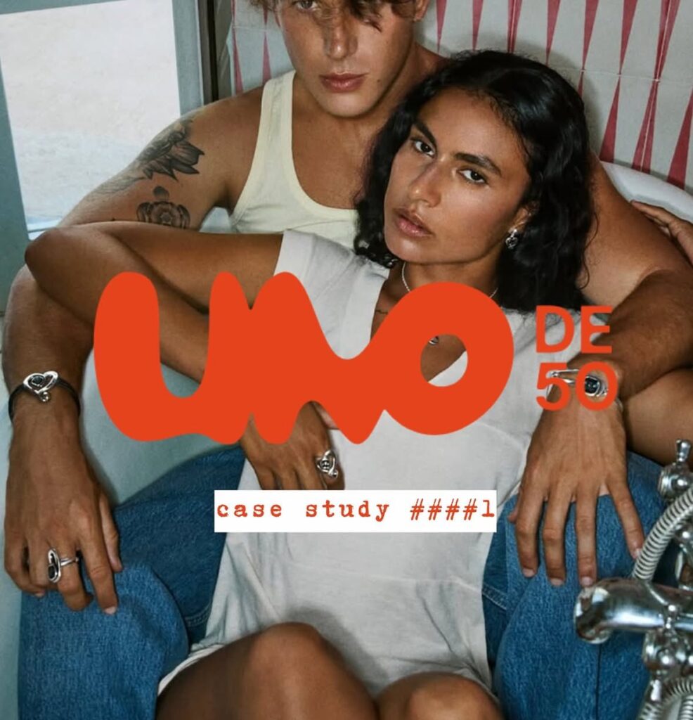
Once defined by its raw, handcrafted aesthetic, the Spanish jewelry brand has reemerged with a sleeker and more refined identity. The shift is subtle yet striking, minimal, bold and unapologetically global. It does not abandon its roots, it sharpens them. This is proof that evolution does not have to mean erasure.
This is more than a new logo or a visual refresh. It is a strategic repositioning that attracts a younger and fashion-forward audience, elevates the brand into the luxury space and integrates seamlessly across both retail and digital platforms.
The best part is that it still feels like UNOde50.
This is the art of rebranding done right. A brand that remains true to its DNA while confidently making space for the future. Modern, bold and unapologetic.
This is how it is done. And we love it.